Adding A Little Texture: The Etsy Store is Open!

_________________________________________________________________________________


The big day is here! We would love for you to check out our new Etsy shop!
We also wanted to say thank you, so we are offering a 15% discount to our blog readers. Simply enter the coupon code GRANDOPENING at checkout. (code expires 9.1.14) 
Texture Design appreciates your support and encouragement!

Keep reading for a behind the scenes look at opening the shop.


Many hours spent designing on the computer! But let's be honest...I LOVE IT!


Then it is time to do test prints to make sure the colors look just right. The one above took several attempts. Once I am happy with the print, it is time to trim it for photo sessions.


Not having an actual studio to take pictures in, one must get creative! Usually the best photos are taken from above the object by the window with lots of light. I usually try different backgrounds behind the prints to see what I like best.


Can you believe that photo session turned into this image below!? 

Then comes setting up shop! Time to use all those photos to create listings in Etsy. Here is a screen shot taken while setting up our shop for the first time.


More listings are slowly being added, so please go check it out for yourself!
https://www.etsy.com/shop/texturedesignco

Thanks again!
Emily

Adding A Little Texture: ReDesign Phase 3

_________________________________________________________________________________

The Texture Etsy Shop is opening August 25th!!!!


One week from today, we'll be opening our Etsy shop! That's Right! August 25th is the big day! It has been a long time in the making, and I'm so glad and so nervous that it is almost here! Thank you to so many of you who have continuously encouraged me in the process. (and offered helpful feedback) 

Here is a sneak peak of a few of the items we'll be offering next week.


Thanks so much for taking a look at our Etsy sneak peak! Next monday, we'll post the link to the shop on the blog and on facebook. If you haven't liked us on facebook yet, please do so you can get all of the updates!

Have a wonderful day!

Adding A Little Texture: Redesign Phase 2


The new Texture website is finally ready! Phew. I'm so excited! I started 5 months ago, and I quickly became my pickiest client. Ha, oops! You can read more about the process below.


For the homepage, I really wanted to play on the idea of "textures". I liked the idea of setting out a variety of items made of various materials -- wood, thread, metal, paper, and fabric. After several photo shoots and trying different backgrounds, I was pretty excited about the final product. Sometimes you know in your head what you want, but it takes some trial and error to get there! But it is all a learning process. 

The new "About" section shares our new mission statement:
"To provide each client with inspiring and high quality designs that meet the needs and functions of the job. We strive for impeccable customer service that is personable and reliable. "


The "Portfolio" section was like piecing together a puzzle, trying to figure out where to place each item in order for them all to stand out. The theme of texture was continued with the various backgrounds used to compliment the particular portfolio item. For example, a yellow ceramic plate sits as the background for the EOS coffee branding. The texture and color of the plate create a cheery kitchen or coffee house setting for the portfolio item. The white washed wood behind the Cotton Sail Consulting business cards creates a nautical atmosphere fitting of the logo. The texture creates a feeling, which goes back to why the name Texture Design Co. was chosen.


The "Blog" section showcases some of our favorite blog posts to date. These will be updated quarterly. I think it will be helpful to continually show our current projects!

We would love for you to check out the new website yourself! 

Thank you so much for checking in with us to read part 2 of our redesign showcase! If you didn't get the chance, definitely check out last week's post from August 4th. Next Monday, I'll start sharing about the upcoming Etsy store! Hip Hip Hooray!

God Bless

Adding A Little Texture: Redesign Phase 1

_________________________________________________________________________________


Over the past few months, I've been working hard to refresh the look of Texture Design and give it a new face. It all started when I decided to redesign the website. (which I'll talk about next week on the blog) But as I began re-working the site, I decided to change up the logo, colors, and branding. (You know how one creative task can lead to twenty more...) So I am taking the next 3 weeks to talk about the entire redesign. Every monday in the month of August, I will talk about the changes in Texture Design and the creative process behind it. Today, I'm talking about the logo, business cards, and other branding ideas!


Above you can see the entire look. My favorite part is how clean and airy it feels. It leaves room to play up textures. You will see an example of this on the new homepage where I use a variety of textured materials. The color of the new logo was a pretty easy choice. I'm attracted to anything seafoam! :) I think it is important to select a color that you are naturally attracted to because then you know you'll continue to like it over time. The new logo is very similar to the old except I placed it in a circle - a small change can make a big difference. I like how the logo contains itself now, it lends itself to more things like labels, stamps, watermarks, etc. You can compare the two versions below. 


I printed my business cards with a different company this time. I decided to try Primo Cards. I think they did a great job. I was very happy with the experience and options. In the very top image you can see that I did purchase a rubber stamp for Texture. It has been a great tool in placing the new logo on all types of materials. The greatest part about the stamp is that it adds "texture" to the logo! I purchased my stamp from www.rubberstamps.net. I would highly recommend them as well.


Check back in every Monday in August for next blog installment of the Texture re-design! Next week I'll be showcasing the new website and talking about the design process!!

Less than 4 weeks until we open our Etsy Shop!!! Woo Hoo! We'll keep you posted!

Thanks for reading! :)

Watercolor Wedding Invitations: Starfish & Beaches

_________________________________________________________________________________

Ashley and Andrew had a beautiful wedding at Amelia Island Plantation on the coast of Florida. Everything about their wedding was inspired by the serene beach setting. Ashley selected blue and green as her accent colors, and we quickly began working on a custom stationery package that would fit her style and coastal location.


Ashley was drawn to the look of watercolors, so I got out the paint set and went to work. I think we were both pretty excited with the look of the starfish on the invitations. We decided to compliment it with a beach scene on the RSVP cards and programs. We printed them on textured paper to give it the feel of watercolor paper. To finalize the entire look, we added navy belly bands with bakers twine wrapped around the center of the invites. They were mailed off in crisp navy envelopes that also offered that coastal feel.


The entire wedding was beautiful and the weather was great. Ashley was a stunning bride, and we are so glad that she let Texture Design help her with her big day!


For more information on custom wedding invitation packages, feel free to send us an email. We would love the opportunity to be a part of your special occasion! God Bless!

(Wedding Photos by J'adore Studios)


Adding A Logo: Cotton Sail Consulting

_________________________________________________________________________________

Cotton Sail Consulting is a new consulting business with a very clear vision. Their mission is to "increase effectiveness by strengthening leadership and applying Biblical principles". The founder just so happens to be one of the greatest men I know -- my dad!


 In his email describing the new concept, he writes:
"The thought of a cotton sail brings to mind the early days of sailing when the skills of seamanship really meant something. Mariners set a course for a new destination. It was a journey marked by obstacles and the excitement of new discoveries. In large measure, however, success depended on competence, leadership and teamwork."


T H E   C H A L L E N G E 
We wanted the logo to have a clean look without getting too trendy or modern. With a business like this, you want to communicate that the company is grounded and constant. Whereas, a company like a hair salon would want a more stylized logo that gives off the impression that they are in line with the latest trends. 

T H E   S O L U T I O N 
Serif fonts (with the little feet on the ends of the letters) are associated with being established, confident, and classic. We found a serif font that still had very clean lines. Paired with a crisp, simple outline of a sail, we had our look! Clean and Classic! (like a good sailboat) We added in some notoriously nautical colors - navy and gold, and we were ready to start the printing press! 

Another fun project completed! (with one of my favorite people!)

Adding a Little Craftsmanship: Landon Lacey Jewelry

_________________________________________________________________________________

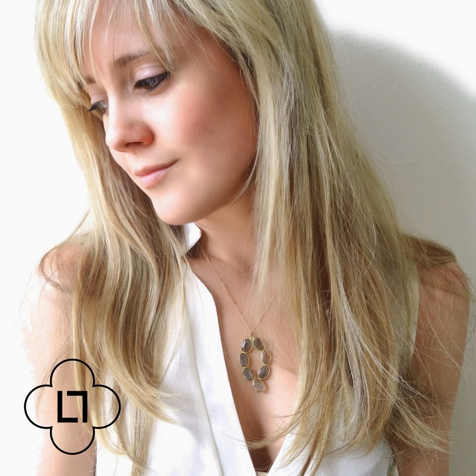
We are so excited for the chance to showcase Landon Lacey Jewelry on our blog! If you remember, we included one of her necklaces on our blog's summer wish list. She had such an interesting story, we thought it would be fun to do an interview with her on the blog! Check it out below.


Store Name:  Landon Lacey Jewelry
Owner:  Landon Lacey
Product: Handmade Necklaces, Earrings & Bracelets

TDC: How did you get started making jewelry?  
Landon: When I was in high school, a friend’s mom taught me how to make glass beads by melting glass onto little sticks under a torch.  I loved watching the glass melt into red-hot globes, and I loved stringing my creations onto wire for necklaces. But my hard-earned little gems were less than beautiful!  I decided to forgo creating my materials from scratch, and instead began a now decade-long hunt for stunning materials made by regional artists to incorporate into my own designs.  Melting glass was my starting point, and it has evolved into the Landon Lacey line I have today.


TDC: You have such an interesting story about how your travels and homes have influenced your designs. Can you share a little bit of that with us?

Landon: Yes!  I feel like my style is a perfect reflection of three of the places I’ve lived.  Twenty-two years in the South left me an appreciation of pearls, pastels, and old gold.  I grew up in Charlotte, North Carolina and went to Wake Forest University, a preppy southern school. I first began selling jewelry in college and was blessed by an extremely supportive system of sororities who encouraged me during my initial hurdles. 

After undergrad, I moved to Thailand to work in an AIDS orphanage called Agape Home.  I didn’t drag my jewelry supplies across the world, so this was a hiatus from actually creating jewelry.  Instead of making jewelry, I allowed myself to be inspired by the delicate Asian symmetry, minimalism, and attention to detail.  I remember paying $2 for some of the best street food I’ve ever had, and being shocked at the way it was presented: a pair of perfectly placed purple orchids, slightly off-center, at the top of my plate of fried rice.  I developed an appreciation for all things sparkly and understated. 

A year and a half after moving to Thailand, I headed back home to get a Masters in Speech-Language Pathology.  I pulled my tools and supplies out of the storage unit, and began creating again.  I went to UNC Chapel Hill for grad school and was again blown away by the network of females around me who supported my growing business.  Southern prep met Asian minimalism in a pretty burst of delicate gold and pastels.

While in graduate school, I met the love of my life who was wrapping up medical school.  He wound up matching for his residency in Chicago; we graduated on the same day, rented a U-Haul, and moved everything (beads and pliers included) to the Windy City.  I fell in love with Chicago the second I saw it.  Gorgeous architecture, killer style, extreme seasons, delicious foods, killer concerts and comedy… this city has everything.  I live downtown on the 28th floor of a high rise next to Navy Pier right on the river.  Looking out my window, I’m reminded why my jewelry took an edgy turn when I moved here: this city is full of sharp angled buildings, shiny glass, fancy cars and high heels.  Bye bye pearls, hello spikes!  You can see all of these places reflected in my jewelry line.


TDC: What is involved in the process of creating and designing jewelry?

Landon: A new piece can be born in a variety of ways.  Sometimes I’m inspired by something I see: a sunset on Lake Michigan can turn into to an ombre fire opal necklace.  Sometimes I’m inspired by other jewelry, like Gwyneth Paltrow’s gorgeous horn necklace she seems to wear daily.  Sometimes I’m inspired by a pendant or stone that may sit in a box or my desk for months until I finally decide how I’m going to use it.  Occasionally I’ll doodle sketches completely from scratch and set out to find the supplies I need to bring it to life.  I try to keep my jewelry relevant and trendy, but also personal and unique to my line.


TDC: Which item in your store is your personal favorite?

Landon: Oh goodness this changes every week!  Right now, I have a gold horn necklace that I hung from a black onyx rosary chain that I just posted to Etsy today.  I wore it to my cousin’s engagement party this past weekend with a funky dress and got a million compliments!  I think that’s my favorite, but I’ll change my mind next week : ) 


TDC: What part of the job do you love the most?

Landon: My customers.  I love how jewelry has opened me up to so many people I wouldn’t otherwise know!  There are people in Chicago who have found me through Etsy, have come over to hand-select their pieces, and we’ve begun a friendship.  Shop owners, bloggers, brides-to-be, book clubs, trunk shows, craft shows, and Christmas parties are all ways that I’ve been able to branch out and meet new people.  Seeing my jewelry on someone’s smiling face is priceless!  It’s an amazing feeling being able to share my art and see it appreciated by so many other people.

TDC: Do you have a favorite Etsy shop to visit?

Landon: Yes!  I love supporting other artists whenever possible, and Anna Woolf at WildCardPottery does great work!  I recently sent my dad a barnacle coffee mug, and he loves it.  Her product is truly unique! I’m also a big fan of SucculentSalon – I can’t get enough of succulents and hers are some of the best.

TDC: You make all of your products in Chicago, IL. Can you share with us some of your favorite spots in the city?
Landon: I’ve been here for a year and feel like I haven’t scratched the surface!  My two favorite restaurants are probably CafĂ© Baba Reeba and Purple Pig.  Both have fabulous tapas-style bites.  For dancing, I love Untitled and for comedy I love Second City.  A fabulous jewelry supply show called InterGem comes through Chicago a few times a year to Rosemont, and I’m able to stock up on new little treasures.  Right now, I’m trying not to repeat places because there is so much to experience – but the one place I keep returning to is Yolk for brunch.  Their coffee is the best!


Tea and Work! Follow Landon Lacey on Instagram here!

Landon, thank you so much for your time! We love your shop and your beautiful craftsmanship! Visit the store here and like Landon Lacey on Facebook to check out more images of her products! 

All photos courtesy of Landon Lacey Jewelry.
1 09 10